Create A Digital Alarm Clock With JavaScript
Learn how to create a digital alarm clock with HTML CSS and Javascript.
- Use HTML to Structure a digital alarm clock.
- Use CSS to style the clock.
- For Functionality of Alarm Clock use Javascript.
The source code for this project is available for download by clicking ‘Download Now’ or cloning the GitHub repository.
Source code of HTML file
<!DOCTYPE html>
<html lang="en">
<head>
<meta charset="UTF-8">
<meta name="viewport" content="width=device-width, initial-scale=1.0">
<title>Alarm Clock</title>
<link rel="stylesheet" href="style.css">
<Script src="Alarm.js" defer></Script>
</head>
<body>
<div class="container">
<div class="wrapper">
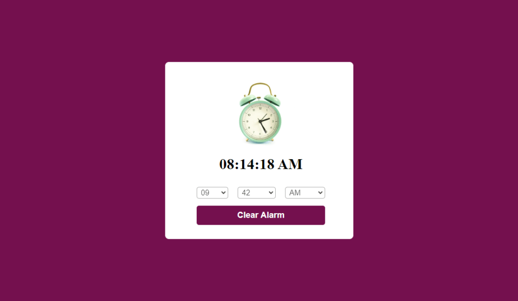
<img src="Alarm.jpg" >
<h1>05:00:00 AM</h1>
<div class="content">
<div class="column">
<select >
<option value="hours" selected hidden>Hour</option>
</select>
</div>
<div class="column">
<select >
<option value="Minutes" selected hidden>Minute</option>
</select>
</div>
<div class="column">
<select >
<option value="AM/PM" selected hidden>AM/PM</option>
</select>
</div>
</div>
<button>Set Alarm</button>
</div>
</div>
</body>
</html>
Explanation
Body Section (<body>):
- Container (<div class=”container”>): Creates a container element to group and organize the content. This element likely has styles applied from “style.css” to control its positioning or layout.
- Wrapper (<div class=”wrapper”>): Another container element within the main container, potentially used for additional layout or styling purposes.
- Image (<img src=”Alarm.jpg”>): Displays an image named “Alarm.jpg” likely representing a visual of an alarm clock.
- Current Time (<h1>05:00:00 AM</h1>): Displays a heading (h1) element with the initial time “05:00:00 AM.” This will likely be replaced with the user’s selected alarm time.
- Content (<div class=”content”>): Another container element, probably used to arrange the clock selection controls.
- Columns (<div class=”column”>): Three columns are created, each likely styled in “style.css” to arrange the dropdown menus horizontally.
- Select Controls (<select>): Three dropdown menus are created using the select element. These will presumably allow the user to set hours, minutes, and AM/PM for the alarm time.
- Placeholder Options (<option value=” hours” selected hidden>Hour</option>): Each dropdown menu has an initial option that displays “Hour,” “Minute,” or “AM/PM” but is disabled (hidden) and has no actual value (value=”hours”). These serve as placeholders until the user selects a valid time.
- Set Alarm Button (<button>Set Alarm</button>): A button element is created to trigger the alarm setting functionality when clicked. This behavior will likely be implemented in the “Alarm.js” script.
Source code of CSS file
*{
    margin: 0;
    padding: 0;
    box-sizing: border-box;
}
.container{
    width: 100%;
    height: 100vh;
    display: flex;
    align-items: center;
    justify-content: center;
    background: #74104e;
}
.wrapper{
    width: 400px;
    background: #fff;
    padding: 30px 30px 30px 38px;
    display: flex;
    align-items: center;
    justify-content: center;
    flex-direction: column;
    border-radius: 8px;
}
.wrapper img{
    max-width: 300px;
}
.wrapper .content{
    width: 100%;
    margin-top: 30px;
    display: flex;
    align-items: center;
    justify-content: center;
}
.wrapper .content.disable{
    opacity: 0.7;
    pointer-events: none;
}
.wrapper .content select{
    font-size: 16px;
    padding: 2px 4px;
    margin: 0 10px;
    border: 1px solid #888888;
    border-radius: 5px;
}
.wrapper button{
    width: 82%;
    margin-top: 15px;
    padding: 10px 0;
    font-size: 18px;
    font-weight: 600;
    outline: none;
    border: none;
    border-radius: 5px;
    background: #74104e;
    color: #fff;
}
Explanation
Imagine this webpage as a stage for your alarm clock. The CSS code acts as the stage manager, meticulously arranging the set pieces and actors (HTML elements) to create a visually captivating performance.
Setting the Stage:
- The * selector is like a universal backstage crew, ensuring all elements start with zero margins and padding, creating a clean slate. It also sets the “box-sizing” property to a specific mode, making element-sizing calculations more predictable.
The Grand Container:
- The .container class is the mighty stage itself. It stretches grandly to fill the entire visible area of the browser window (100% width and height), making the most of the available space. It also employs a clever trick called “flexbox” allowing for flexible positioning of the content within. Think of it as a stage that can adapt to different screen sizes. To create a dramatic atmosphere, the stage is bathed in a deep purple (#74104e) background.
The Clock Tower:
- The .wrapper class represents the clock tower, a central white structure (background: #fff) housing the clock face and controls. It has a width of 400 pixels, ensuring it’s not too large or small. Padding is strategically applied (30px on most sides, 38px on the right) to create a balanced look, potentially accommodating the alarm image. Flexbox is again employed within the tower, arranging elements in a neat column (flex-direction: column). The tower boasts a touch of elegance with rounded corners (border-radius: 8px).
- The .wrapper img selector focuses on the alarm image within the tower. It acts like a spotlight, ensuring the image doesn’t overflow its designated space by setting a maximum width of 300 pixels.
The Clock Face and Controls:
- The .wrapper .content class targets the clock face area where the user interacts with the time selection. It stretches across the entire width of the tower (100%) and is positioned below the image with a 30px margin (margin-top: 30px) for better visual separation. Flexbox takes center stage again, ensuring the selection elements are neatly centered both horizontally and vertically.
- A potential hidden feature is revealed by the .wrapper .content.disable selector. It seems like a stagehand might dim the clock face (opacity: 0.7) and disable user interaction (pointer-events: none) when an alarm is set, preventing accidental changes.
- The .wrapper .content select selector targets the individual dropdown menus, the heart of the time selection process. Each menu boasts a clear and readable font size of 16 pixels. Padding (2px 4px) and margins (0 10px) create a comfortable space for the user to interact with them. A light gray border (1px solid #888888) defines the menu’s outline, and rounded corners (border-radius: 5px) add a touch of polish.
The Alarm Button:
- The .wrapper button selector shines a spotlight on the critical alarm button. It occupies a prominent space, taking up 82% of the tower’s width, with some breathing room on either side (margin-top: 15px). The button itself is styled with a bold presence. A generous padding of 10px on the top and bottom provides ample space for the button text. The font size is increased to 18 pixels for better readability, and a weight of 600 makes the text appear bolder. The button boasts a sleek and stylish look with a deep purple background (#74104e) matching the container and crisp white text (#fff) for maximum contrast. There are no outlines or borders to distract from its clean design, and rounded corners (border-radius: 5px) add a touch of sophistication.
Source code of JavaScript
const currentTime = document.querySelector("h1"),
content = document.querySelector(".content"),
selectMenu = document.querySelectorAll("select"),
setAlarmBtn = document.querySelector("button");
let alarmTime = null, isAlarmSet = false,
ringtone = new Audio("ringtone.mp3");
for(let i = 1; i < 13; i++){
    i = i < 10 ? "0" + i : i;
    let option = `<option value="${i}">${i}</option>`;
    selectMenu[0].firstElementChild.insertAdjacentHTML("afterend" , option);
}
for(let i = 0; i < 60; i++){
    i = i < 10 ? "0" + i : i;
    let option = `<option value="${i}">${i}</option>`;
    selectMenu[1].firstElementChild.insertAdjacentHTML("afterend" , option);
}
for(let i = 0; i < 2; i++){
    let ampm = i == 0 ? "AM" : "PM"
    let option = `<option value="${ampm}">${ampm}</option>`;
    selectMenu[2].firstElementChild.insertAdjacentHTML("afterend" , option);
}
setInterval(()=>{
    let date = new Date(),
    h = date.getHours(),
    m = date.getMinutes(),
    s = date.getSeconds(),
    ampm = "AM";
    if (h > 12) {
        h = h - 12 ;
        ampm = "PM";
    }
    h = h == 0 ? h = 12 : h ;
    h = h < 10 ? "0" + h : h ;
    m = m < 10 ? "0" + m : m ;
    s = s < 10 ? "0" + s : s ;
    currentTime.innerText = `${h}:${m}:${s} ${ampm}`;
    if(alarmTime == `${h}:${m} ${ampm}`)
    {
        ringtone.play();
        ringtone.loop = true;
    }
},1000);
function alarm(){
        if(isAlarmSet){
            alarmTime="",
            ringtone.pause();
            content.classList.remove("disable");
            setAlarmBtn.innerText = "Set Alarm";
            return isAlarmSet = false;
        }
        let time = `${selectMenu[0].value}:${selectMenu[1].value} ${selectMenu[2].value}`;
        if(time.includes("hours") || time.includes("Minutes") || time.includes("AM/PM"))
        {
            return alert("please select a valid time");
        }
        isAlarmSet = true;
        alarmTime = time;
        content.classList.add("disable");
        setAlarmBtn.innerText = "Clear Alarm";
}
setAlarmBtn.addEventListener("click",alarm);
Explanation
Setting the Stage:
- The code acts as the stage manager, meticulously arranging the elements:
- The <h1> element becomes the prominent clock face, displaying the current time in bold letters (currentTime).
- The element with the class “.content” transforms into the control panel (content), housing the dropdown menus for setting the alarm time.
- All select elements (dropdown menus) become actors, ready to be dressed with time options (selectMenu). They’ll be positioned strategically on the control panel.
- The button element becomes the control switch (setAlarmBtn), labeled “Set Alarm” initially, waiting for user interaction.
Props and Costumes:
- The code prepares the props for the time selection:
- It creates numerous neatly formatted time options for hours, minutes, and AM/PM, like costumes for the actors (dropdown menus). It ensures single-digit times have leading zeros for a polished look.
- These options are then strategically placed within the dropdown menus, ready for the user to choose (insertAdjacentHTML).
The Clock’s Performance:
- The code sets up a continuous loop, like an ever-ticking metronome:
- Every second, it retrieves the current date and time using a Date object, like a backstage clock prompting the actors (dropdown menus) for their positions.
- It extracts the hours, minutes, and seconds, akin to the actors moving their hands on the clock face.
- It handles AM/PM conversion, ensuring a smooth transition between day and night scenes.
- The extracted time is then meticulously formatted with leading zeros for a polished clock face display (currentTime.innerText).
- The code constantly checks if the formatted current time matches a pre-set alarm time (alarmTime).
The Alarm Sounds:
- If the current time matches the pre-set alarm time (alarmTime):
- The code acts like a sound technician, playing the “ringtone.mp3” audio, and simulating the alarm sound. The ringtone is set to loop (ringtone.loop = true) to create a continuous alarm.
The Control Switch:
- The “Set Alarm” button awaits user interaction:
- When clicked, it triggers the alarm function, like a stagehand responding to the user’s command.
- The alarm function checks if an alarm is currently set (isAlarmSet).
- If yes, it acts like a stage manager silencing the alarm:
- Clears the pre-set alarm time (alarmTime).
- Pauses the ringtone (ringtone.pause()).
- Reactivates the control panel (content) for user interaction by removing the “disable” class.
- Resets the button text back to “Set Alarm” for the next alarm setting.
- If no alarm is set, it initiates the alarm setup:
- Gathers the user’s time from the dropdown menus, constructing a new alarm time string.
- Quickly checks for valid time selection and alerts the user if necessary (e.g., placeholder options selected).
- If the time is valid, it sets the pre-set alarm time (alarm time).
- Disables the control panel (content) to prevent accidental changes during an active alarm.
- Transforms the button text to “Clear Alarm” indicating an active alarm.
Thanks for reading this Article.