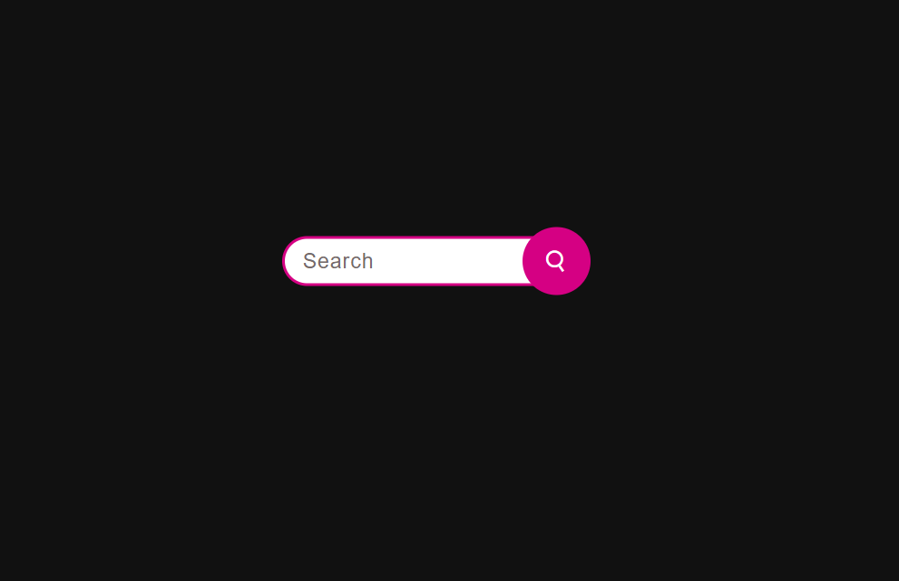
LEARN HOW TO CREATE SEARCH BAR WITH HTML AND CSS

How to create a search bar with HTML and CSS?
- Use HTML to structure a search bar
- Use CSS to style a search bar.
The source code for this project is available for download by clicking ‘Download Now’ or cloning the GitHub repository.
Source code of HTML file.
<!DOCTYPE html>
<html lang="en">
<head>
    <meta charset="UTF-8">
    <meta name="viewport" content="width=device-width, initial-scale=1.0">
    <title>Search Bar</title>
    <link rel="stylesheet" href="style.css">
    <link href='https://unpkg.com/boxicons@2.1.4/css/boxicons.min.css' rel='stylesheet'>
</head>
<body>
    <div class="container">
        <div class="wrapper">
            <input type="text" placeholder="Search">
            <div class="button">
                <i class='bx bx-search'></i>
            </div>
        </div>
    </div>
</body>
</html>
Save this code with .html extension.
Explanation.
1. Body section:
- <body>: This section contains the visual content of the web page.
- <div class=”container”>: This div element acts as a container for the entire search bar layout. It can be used for styling purposes by using the “container” class in the CSS file.
- <div class=”wrapper”>: Another div element that acts as a wrapper for search input and buttons. It can be used to check new processes or processes in the product.
- <input type=”text” placeholder=”Search”>: This input element is a text field where users can type their search query. The type=”text” attribute specifies that it should accept text input, and the placeholder=”Search” attribute tells the user what to enter.
- <div class=”button”>: This div element contains the search button.
<i class=’bx bx-search’>: This i element may use the icon font from the “boxicons” library to display the search icon in the button. The specific class name (bx bx-search) specifies the symbolic path of the library.
2. Closing characters:
- All of their open icons (HTML, header, body, div, etc.) (</html>, </head>, </body>, </div>, etc.) are closed for insertion of the end symbol of each element.
Additional Notes:
This code snippet only represents the basic HTML structure. The actual use of the search bar, such as sending a search query to the server or displaying results, will require additional JavaScript code.
The styling of the search bar elements is defined in an external CSS file called “style.css”.
Source code of CSS file.
*
{
padding: 0px;
margin: 0px;
box-sizing: border-box;
}

.container
{
height: 100vh;
width: 100%;
background: #111111;
}

.wrapper
{
position: absolute;
left: 48%;
top: 45%;
transform: translate(-50% , -50%);
padding: 10px;
}

input
{
height: 55px;
width: 0px;
background: #ffffff;
outline: none;
font-size: 23px;
font-weight: 500;
letter-spacing: 1px;
color: #000000;
padding: 5px 20px;
border: 3px solid #d50083;
border-radius: 50px;
transition: all 0.7s ease;
}

::placeholder
{
color: #746a6a;
}

.button
{
position: absolute;
right: 0;
top: 0;
height: 75px;
width: 75px;
background: #d50083;
border-radius: 50%;
display: flex;
align-items: center;
justify-content: center;
}

.button i
{
font-size: 28px;
font-weight: 500;
color: #ffffff;
transition: all 0.7s ease;
}

.wrapper:hover input
{
width: 330px;
}

.wrapper:hover i
{
transform: rotate(-350deg);
}
Save this code as style.css
Explanation.
Container:
- .container: Points to an element of the class “container”.
Wrapper:
- .Wrapper: uses the class “wrapper” to target an element.
- position: absolute; Positions an element relative to its instant ancestor (typically a field).
- Left: 48%; top: 45%; transform: translate(-50% , -50%); Place an element horizontally and vertically in the middle of that item using absolute placement and transformation.
- Padding: 10px; Adds 10px padding to all facets of the detail.
input:
- input: Target all <> items inside the web page.
- height: 55px; width: 0px; Set the preliminary height to 55px and the initial width to 0px, and is the hidden input area.
- background: #ffffff; Sets the background color of the enter area to white (#ffffff).
- outline: none; Remove the default browser outline across the input place.
- Font-length: 23px; font-weight: 500; is used to set the font size 25px and font-weight 500 for the enter value.
- letter-spacing: 1px; it is used to produce 1px sapce among alphabets.
- transition: all 0.7s easier; Provides smooth transition for all dynamic assets.
::placeholder:
- ::placeholder: targets the placeholder text in the input field.
- color: #746a6a; Set placeholder text color to light white (#746a6a).
button:
- .button: Points to an element with the class “button”.
- position: absolute; Position the button completely within the wrapper element.
- right: 0; top: 0; button at the top-right corner of the wrapper element.
- height: 75px; width: 75px; Set the button width as a 75px square.
- background: #d50083; Set the background color of the button to pink (#d50083).
- border-radius: 50%; The button is equally circumscribed.
- display: Flex; align-item: center; justify-content: center; centers the button’s content (an icon) at the top and bottom.
- i: Select all <i> elements (symbols) in the button.
- font-size: 28px; font-weight: 500; color: #ffffff; Sets the styling (font size, weight, and color) of the icon.
- transition: all 0.7s easier; Provides smooth transitions for rotating the icon on hover.
Hover Effect:
- .wrapper: hover input: Hovers over the input area when its parent element (wrapper) is hovered.
- width: 330px; Extends the width of the text area to 330px, highlighting it and allowing text insertion.
- .wrapper:hover i: Hovers the icon inside the button when its parent element (wrapper) is hovered over.
- transform: Rotate.
I am extremely inspired with your writing skills and also with the layout on your
blog. Is this a paid subject matter or did you modify it yourself?
Anyway keep up the nice quality writing, it is uncommon to peer a nice weblog
like this one nowadays.