LEARN HOW TO CREATE A SIMPLE SIGNUP PAGE WITH HTML CSS

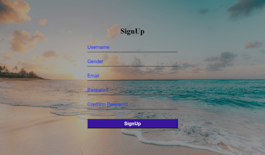
How to create a simple signup page with HTML CSS?
- Create an HTML file to structure the SIGNUP page.
- Use a form tag to get input from the user.
- Create a CSS file to style the content of the page.
The source code for this project is available for download by clicking ‘Download Now’ or cloning the GitHub repository.
Source code of HTML file.
<!DOCTYPE html>
<html lang="en">
<head>
    <meta charset="UTF-8">
    <meta name="viewport" content="width=device-width, initial-scale=1.0">
    <title>Signup</title>
    <link rel="stylesheet" href="Style.css">
</head>
<body>
    <form action="">
        <h1>SignUp</h1>
        <input type="text" placeholder="Username" required>
        <input type="text" placeholder="Gender" list="Items" required>
        <datalist id="Items">
            <option>Male</option>
            <option>Female</option>
            <option>Custom</option>
        </datalist>
        <input type="email" placeholder="Email" required>
        <input type="password" placeholder="Password">
        <input type="password" placeholder="Conform Password">
        <button type="submit">SignUp</button>
    </form>
</body>
</html>
Save this code as SignUp.html
Explanation
Signup form:
The signup form is defined in <body> Section.
- Form displays level 1 heading “Signup” at the top of the screen.
- <form>: Tag uses five input tags to get data from the user.
- type=”text”: is used to create a text input field to accept name,address,or other kind of text form the user.
- placeholder: Attribute is used in the Input field as a hint.
- type=”email”: This is used to create an email field with built-in validation.
- type=”password”: This is used to create a password field where text is displayed as asterisks.
Source code of CSS file.
*{
    margin: 0;
    padding: 0;
    box-sizing: border-box;
}
body
{
    display: flex;
    align-items: center;
    justify-content: center;
    flex-direction: column;
    height: 100vh;
    background:linear-gradient(rgba(0,0,0,0.3),rgba(0,0,0,0.3),rgba(0,0,0,0.3)), url(background.jpg) ;
    background-size: cover;
}
form
{
    text-align: center;
}
form h1
{
    margin-bottom: 30px;
}
input
{
    display: block;
    width: 380px;
    height: 40px;
    margin: 20px;
    background: transparent;
    border: none;
    outline: none;
    font-size: 20px;
    font-weight: 500;
    border-bottom: 1px solid black;
}
::placeholder
{
    color:#0026ff;
}
button
{
    width: 380px;
    height: 40px;
    font-size: 20px;
    font-weight: 600;
    color: #ffffff;
    background: #39159b;
    border-radius: 10px;
    margin-top: 20px;
    border: none;
    outline: none;
}
Save this code as Style.css
Explanation with an example.
General Settings:
- * This encompasses all components present on the web page. It communicates a message, stating, “Greetings everybody pay attention!”.
- Inside the body of * margin and padding properties are set to 0 to eliminates any default spacing and Box-sizing ensures that the element’s size is determined based on its borders rather than its padding.
Body Section:
- The CSS property “display: flex; align-items: center; justify-content: center;” is used to centrally position the content on the screen, both horizontally and vertically.It can be compared to placing a cake stand in the exact middle of a table.
- When using the CSS property “flex-direction: column;”, it arranges the elements vertically. This stacking effect allows the elements to be neatly positioned on top of each other.
- The CSS property “height: 100vh;” ensures that the background extends to the full height of the viewport, similar to a tall cake stand that reaches the ceiling.
- background:linear-gradient(rgba(0,0,0,0.3),rgba(0,0,0,0.3),rgba(0,0,0,0.3)), url(background.jpg) ; produces an appealing multi-tiered background appearance by incorporating a muted black layer and an image of your choice (replace “background.jpg” with your image).
Form Section:
- The “text-align: center;” property aligns the text in the middle of the form, similar to placing the phrase “Happy Birthday” in the center of a cake.
form h1:
- This targets the heading inside the form (probably a title). margin-bottom: 30px; adds space below it, like leaving room for candles.
Input section:
- This applies a style to all input fields, which are the areas where you enter your username and password.
- The dimensions of the fields are specified through the “display: block; width: 380px; height: 40px; margin: 20px;” CSS properties. This allows for the proper arrangement and spacing of the fields, similar to the even distribution of sprinkles on a cake.
- By eliminating needless borders and emphasizing the fields, the transparency of the background enhances the overall appearance, giving it a clean and contemporary look.
- Font-length: 20px; font-weight: 500; these set the textual content length and boldness, like choosing the best sprinkle length.
- Border-bottom: 1px solid black; This provides a skinny black line under each area, like a sensitive icing outline.
::placeholder:
- This pattern is the textual content that appears within the fields before you find anything. Color: #0026ff; makes it a cool blue shade, like fancy sprinkles with a touch of mystery.
Button:
- Width: 380px; height: 40px; font-size: 20px; font-weight: 600;: these define its length and text look, like choosing a massive, bold cherry.
- Color: #ffffff; background: #39159b; This gives it a white textual content on darkish pink color scheme, like a sweet and stylish cherry.
- Margin-top: 20px; This adds space above the button, like setting the cherry on top of the cake properly.
Thanks for reading this article.