BUILD AN E-COMMERCE WEBSITE WITH HTML AND CSS
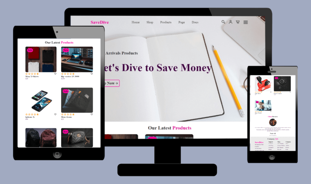
How to build an e-commerce website with HTML and CSS?
- Use HTML to Structure the e-commerce website.
- Use CSS to style an e-commerce website.
The source code for this project is available for download by cloning the GitHub repository.
Source code of HTML file.
<!DOCTYPE html>
<html lang="en">
<head>
    <meta charset="UTF-8">
    <meta name="viewport" content="width=device-width, initial-scale=1.0">
    <title>E-commerece website</title>
    <link rel="stylesheet" href="style.css">
    <link href='https://unpkg.com/boxicons@2.1.4/css/boxicons.min.css' rel='stylesheet'>
</head>
<body>
    <!---- Header Start---->
    <header>
        <a href="#" class="logo">
            SaveDive
        </a>
        <ul class="nav-list">
            <li><a href="#Home">Home</a></li>
            <li><a href="#">Shop</a></li>
            <li><a href="#">Products</a></li>
            <li><a href="#">Page</a></li>
            <li><a href="#">Docs</a></li>
        </ul>
        <div class="nav-icons">
            <a href="#"><i class='bx bx-search-alt-2'></i></a>
            <a href="#"><i class='bx bx-user'></i></a>
            <a href="#"><i class='bx bx-cart-alt'></i></a>
            <div class="bx bx-menu" id="menu-icon"></div>
        </div>
    </header>
    <!---- Header End---->
    <!---- Main Start---->
    <section class="main-content" id="Home">
        <div class="main-text">
            <h1>New Arrivals Products</h1>
            <H4>Let's Dive to Save Money</H4>
            <a href="#" class="main-btn">
                Shop Now <i class="bx bx-right-arrow-alt"></i>
            </a>
        </div>
    </section>
    <!---- Main End---->
    <!--- Products Section Starts--->
    <section class="product-container">
        <div class="heading-text heading">
            <h2>Our Latest <span>Products</span></h2>
        </div>
        <div class="products-items">
            <div class="row">
                <img src="shirts.jpg" alt="">
                <div class="product-text">
                    <h5>Sale</h5>
                </div>
                <div class="product-icon">
                    <i class='bx bx-heart' ></i>
                </div>
                <div class="product-ratting">
                    <i class="bx bx-star"></i>
                    <i class='bx bx-star' ></i>
                    <i class='bx bx-star' ></i>
                    <i class='bx bx-star' ></i>
                    <i class='bx bxs-star-half ' ></i>
                </div>
                <div class="price">
                    <h4>Man T-Shirts</h4>
                    <p>$20</p>
                </div>
            </div>
            <div class="row">
                <img src="laptop.jpg" alt="">
                <div class="product-text">
                    <h5>New</h5>
                </div>
                <div class="product-icon">
                    <i class='bx bx-heart' ></i>
                </div>
                <div class="product-ratting">
                    <i class="bx bx-star"></i>
                    <i class='bx bx-star' ></i>
                    <i class='bx bx-star' ></i>
                    <i class='bx bx-star' ></i>
                    <i class='bx bxs-star-half ' ></i>
                </div>
                <div class="price">
                    <h4>Hp vostro 15 3000</h4>
                    <p>$139</p>
                </div>
            </div>
            <div class="row">
                <img src="mobile.jpg" alt="">
                <div class="product-icon">
                    <i class='bx bx-heart' ></i>
                </div>
                <div class="product-ratting">
                    <i class="bx bx-star"></i>
                    <i class='bx bx-star' ></i>
                    <i class='bx bx-star' ></i>
                    <i class='bx bx-star' ></i>
                    <i class='bx bxs-star-half ' ></i>
                </div>
                <div class="price">
                    <h4>Iphone X</h4>
                    <p>$99</p>
                </div>
            </div>
            <div class="row">
                <img src="pants.jpg" alt="">
                <div class="product-text">
                    <h5>Sale</h5>
                </div>
                <div class="product-icon">
                    <i class='bx bx-heart' ></i>
                </div>
                <div class="product-ratting">
                    <i class="bx bx-star"></i>
                    <i class='bx bx-star' ></i>
                    <i class='bx bx-star' ></i>
                    <i class='bx bx-star' ></i>
                    <i class='bx bxs-star-half ' ></i>
                </div>
                <div class="price">
                    <h4>Man Jeans</h4>
                    <p>$23</p>
                </div>
            </div>
            <div class="row">
                <img src="school-bag.jpg" alt="">
                <div class="product-icon">
                    <i class='bx bx-heart' ></i>
                </div>
                <div class="product-ratting">
                    <i class="bx bx-star"></i>
                    <i class='bx bx-star' ></i>
                    <i class='bx bx-star' ></i>
                    <i class='bx bx-star' ></i>
                    <i class='bx bxs-star-half ' ></i>
                </div>
                <div class="price">
                    <h4>School Bags</h4>
                    <p>$32</p>
                </div>
            </div>
            <div class="row">
                <img src="hand-bag.jpg" alt="">
                <div class="product-text">
                    <h5>Hot</h5>
                </div>
                <div class="product-icon">
                    <i class='bx bx-heart' ></i>
                </div>
                <div class="product-ratting">
                    <i class="bx bx-star"></i>
                    <i class='bx bx-star' ></i>
                    <i class='bx bx-star' ></i>
                    <i class='bx bx-star' ></i>
                    <i class='bx bxs-star-half ' ></i>
                </div>
                <div class="price">
                    <h4>Hand Bag</h4>
                    <p>$99</p>
                </div>
            </div>
            <div class="row">
                <img src="shoes.jpg" alt="">
                <div class="product-icon">
                    <i class='bx bx-heart' ></i>
                </div>
                <div class="product-ratting">
                    <i class="bx bx-star"></i>
                    <i class='bx bx-star' ></i>
                    <i class='bx bx-star' ></i>
                    <i class='bx bx-star' ></i>
                    <i class='bx bxs-star-half ' ></i>
                </div>
                <div class="price">
                    <h4>Nike Shoes</h4>
                    <p>$67</p>
                </div>
            </div>
            <div class="row">
                <img src="camera.jpg" alt="">
                <div class="product-text">
                    <h5>New</h5>
                </div>
                <div class="product-icon">
                    <i class='bx bx-heart' ></i>
                </div>
                <div class="product-ratting">
                    <i class="bx bx-star"></i>
                    <i class='bx bx-star' ></i>
                    <i class='bx bx-star' ></i>
                    <i class='bx bx-star' ></i>
                    <i class='bx bxs-star-half ' ></i>
                </div>
                <div class="price">
                    <h4>Latest Camera</h4>
                    <p>$119</p>
                </div>
            </div>
            <div class="row">
                <img src="watch.jpg" alt="">
                <div class="product-text">
                    <h5>Hot</h5>
                </div>
                <div class="product-icon">
                    <i class='bx bx-heart' ></i>
                </div>
                <div class="product-ratting">
                    <i class="bx bx-star"></i>
                    <i class='bx bx-star' ></i>
                    <i class='bx bx-star' ></i>
                    <i class='bx bx-star' ></i>
                    <i class='bx bxs-star-half ' ></i>
                </div>
                <div class="price">
                    <h4>Mans Watch</h4>
                    <p>$19</p>
                </div>
            </div>
        </div>
    </section>
    <!--- Products Section End--->
    <!--- client-review-section Starts--->
    <section class="client-reviews">
        <div class="reviews heading">
            <h2><span>Client </span>Reviews</h2>
            <img src="Nasir-Ali.jpg" >
            <p>
                Lorem ipsum, dolor sit amet consectetur adipisicing elit. Similique tenetur maiores ratione eum, aspernatur dignissimos molestiae.
                <br>
                Praesentium ipsam atque facilis illum. Possimus repellendus est doloribus expedita, nesciunt debitis incidunt sint.
            </p>
            <h2>Nasir Ali</h2>
            <p>CEO of SaveDive</p>
        </div>
    </section>
    <!--- client-review-section End--->
    <!--- Contact Section Starts--->
    <section class="contact">
        <div class="heading">
            <h2>Company<span> Info</span></h2>
        </div>
        <div class="contact-info ">
            <div class="first-info info">
                <h2>SaveDive</h2>
                <p>Spanking plaza Tarlai Islamabad</p>
                <p>+92 334 546346</p>
                <P>Admin@savedive.com</P>
                <div class="social-icons">
                    <a href="#"><i class="bx bxl-facebook"></i></a>
                    <a href="#"><i class="bx bxl-twitter"></i></a>
                    <a href="#"><i class="bx bxl-instagram-alt"></i></a>
                    <a href="#"><i class="bx bxl-youtube"></i></a>
                </div>
            </div>
            <div class="second-info info">
                <h4>Support</h4>
                <p>Contact Us</p>
                <p>About Page</p>
                <p>Shopping & Returns</p>
                <p>Privacy</p>
            </div>
            <div class="third-info info">
                <h4>Shop</h4>
                <p>Man's Shoping</p>
                <p>Women's Shoping</p>
                <p>Kid's Shoping</p>
                <p>Discount</p>
            </div>
            <div class="fourth-info info">
                <h4>Company</h4>
                <p>About</p>
                <p>Affiliate</p>
                <p>Partners</p>
                <p>Login</p>
            </div>

        </div>
    </section>
    <!--- Contact Section End--->
</body>
</html>
Save this code with .HTML extension.
Explanation.
1.Body Section:
- The visible content of the web page is written in<body> section.
2. Header Section:
- The <header> section contains the web page’s elements, typically the logo, navigation menu, and search bar.
- Logo: The <a href=”#” class=”logo”>SaveDive</a> tag is a link element with the class “logo” that displays the text “SaveDive” and links to the homepage (href=”#” .. ).
- Navigation menu: An unstructured list (<ul>) element is a navigation menu with list items (<li>). Each item list contains an anchor tag (<a>) that indicates a link to a specific part of the web page or an external web page.
- Search and User Identifiers: Anchortags with <i> elements specify identifiers for the search (bx bx-search-alt-2) and user profile (bx bx-user).
- Menu icon: The <div class=”bx bx-menu” id=”menu-icon”></div> element specifies the hamburger menu icon (bx bx-menu) used for navigation.
3. Main Content Section:
- The <section class=”main-content” id=”Home”> section describes the main content area of the web page with the ID “Home”.
- Special notes: The <h1> and <h4> elements refer to the headings “New Features” and “Let’s Dive in to Save Money,” respectively.
- The Buy Now button: <a href=”#” class=”main-btn”>Buy Now <i class=”bx bx-right-arrow-alt”></i> </a> tag is a button element the “Shop Now “ with the text and arrow icon (bx bx-right-arrow-alt) associated with a particular page (`href=”#” is currently not associated with anything).
4. Products Section:
- The <section class=”product-container”> section displays the product listings.
- Heading: The <h2> element displays the heading “Our Latest Products”.
- Product Rows: The product listings are divided into rows using the div element with the class “row”. Each row contains an image, product details, price, and rating.
5. Client Review Section:
- The <section class=”client-reviews”> section displays a client review and information.
- Review Heading: The <h2> element displays the heading “Client Reviews”.
- Client Image: The <img src=”Nasir-Ali.jpg”> tag displays the image of the client.
- Text: The <p> element displays the client’s review.
- Client Name and Title: The <h2> and <p> elements display the client’s name (Nasir Ali) and title (CEO of SaveDive).
6. Contact Section:
- The <section class=”contact”> section displays the company information and contact details.
- The <h2> tag defines a heading element with the text “Company Info”.
- The <div> tag with the class “contact-info” likely groups the contact details.
- Four inner <div> tags, each with the class “info”, likely style and organize different contact information sections like company address, phone number, email, social media links, support options, shop categories, and company information.
- Each information section likely uses various HTML elements like <h2>, <p>, <a>, and <i class=’bx bxl-facebook’></i> to display text, links, and icons.
Source code of CSS file.
*
{
    margin: 0;
    padding: 0;
    box-sizing: border-box;
    scroll-behavior: smooth;
    list-style: none;
    text-decoration: none;
}
:root
{
    --first-text-color:#2c2c2c;
    --second-text-color:#400142;
    --third-text-color:#ff8c00;
    --main-color:#ff039e;
    --bg-color:#ebebeb;
}
header
{
    position: fixed;
    width: 100%;
    top:0;
    right: 0;
    display: flex;
    align-items: center;
    justify-content: space-between;
    padding: 20px 10%;
}
.logo
{
    color: var(--main-color);
    font-size: 26px;
    font-weight: 600;
}
.nav-list
{
    display: flex;
}
.nav-list a
{
    color: var(--first-text-color);
    font-size: 18px;
    padding: 10px 20px;
    font-weight: 400;
    transition: all 0.5s ease;
}
.nav-lista:hover
{
    color: var(--main-color);
}
.nav-icons
{
    display: flex;
    align-items: center;
}
.nav-icons i
{
    margin-right: 15px;
    color: var(--first-text-color);
    font-size: 25px;
    font-weight: 400;
    transition: all 0.5s ease;
}
.nav-iconsi:hover
{
    color: var(--main-color);
    transform: scale(1.2);
}
#menu-icon
{
    font-size: 35px;
    color: var(--first-text-color);
    z-index: 1000;
    cursor: pointer;
}
section
{
    padding: 0% 10%;
}
.main-content
{
    width: 100%;
    height: 100vh;
    padding-left: 13%;
    background-image: url(background.jpg);
    background-size:cover;
    background-position: center;
    display: grid;
    grid-template-columns: repeat(1 ,1fr);
    align-items: center;
}
.main-content h1
{
    color: var(--first-text-color);
}
.main-content h4
{
    color: var(--second-text-color);
    font-size: 60px;
    margin:35px 0 35px 0px
}
.main-btn
{
    width: 130px;
    height: 40px;
    display: inline-flex;
    align-items: center;
    justify-content: center;
    font-size: 22px;
    font-weight: 600;
    border-radius: 6px;
    border: 2px solid var(--main-color);
    color: var(--first-text-color);
    transition: all 0.5s ease;
}
.main-btn:hover
{
    background: var(--main-color);
    transform: scale(1.1);
}
.heading h2
{
    color: var(--first-text-color);
    font-size: 28px;
    text-align: center;
    padding: 20px 0 ;
}
.heading span
{
    color: var(--main-color);
}
.products-items
{
    display: grid;
    grid-template-columns: repeat(auto-fit , minmax(260px,auto));
    gap: 2.5rem;
}
.row
{
    position: relative;
    transition: all 0.5s ease;
}
.row img
{
    width: 100%;
    height: 70%;
    transition: all .5s ease;
    border-radius: 10px;
}
.row img:hover
{
    transform: scale(0.9);
}
.product-text h5
{
    position: absolute;
    top: 14px;
    left: 14px;
    font-size: 22px;
    font-weight: 700;
    color: var(--second-text-color);
    background: var(--main-color);
    padding: 4px 6px;
    border-radius: 40%;
}
.product-icon
{
    position: absolute;
    right: 0;
    font-size: 20px;
}
.product-icon:hover
{
    color: var(--main-color);
}
.product-ratting i
{
    color: var(--third-text-color);
    font-size: 20px;
}
.price h4
{
    color: var(--first-text-color);
    font-size: 18px;
    letter-spacing: 1px;
}
.price p
{
    color: var(--second-text-color);
    font-size: 15px;
}
.client-reviews
{
    text-align: center;
}
.reviews img
{
    width: 120px;
    height: auto;
    border-radius: 60px;
    margin: 10px 0;
}
.reviews p
{
    color: var(--second-text-color);
    font-size: 16px;
    margin-bottom: 10px;
}
.reviews h2
{
    color: var(--first-text-color);
    font-size: 25px;
    padding: 10px 0;
}
.contact
{
    background: var(--bg-color);
}
.contact-info
{
    display: grid;
    grid-template-columns: repeat(4,auto);
    gap: 1rem;
}
.contact-info h2
{
    color: var(--main-color);
    font-size: 35px;
}
.info h4
{
    font-size: 20px;
}
.info p
{
    color: var(--second-text-color);
    line-height: 2;
    transition: all 0.5s ease;
}
.infop:hover
{
    color: var(--main-color);
    transform: scale(1.1);
}
.social-icons i
{
    color: var(--third-text-color);
    font-size: 23px;
    margin: 10px 10px 20px 0;
    transition: all 0.5s ease;
}
.social-icons i:hover
{
    color: var(--main-color);
    transform: scale(1.3);
}
@media (max-width:890px)
{
    header
    {
        padding: 20px 3%;
        transition: 0.4s;
    }
}
@media(max-width:630px)
{
    .main-content h1
    {
        margin-left: -10%;
        font-size: 40px;
        transition: .8s;
    }
    .main-contenth4
    {
        font-size: 30px;
        transition: .8s;
    }
}
@media(max-width:750px)
{
    .nav-list
    {
        position: absolute;
        top: 100%;
        right: -100%;
    }
}
Save this code as style.css
Explanation.
Global Styles:
- Explain the * selector that resets default browser styles and ensures consistency.
- Discuss properties like margin: 0; padding: 0; box-sizing: border-box; and their impact on element layout.
- Introduce variables using :root for colors (–first-text-color, etc.) and their benefits for maintainability.
- Dedicate lines to explaining each color variable and its purpose (main color, text colors, etc.).
Header:
- Explain position: fixed; top: 0; for the header’s fixed position at the top of the page.
- Discuss width: 100%; for full-width coverage and display: flex for arranging elements using flexbox.
- Breakdown justify-content: space-between for aligning elements horizontally at opposite ends.
- Dedicate lines explaining styles for the logo (color, font size, weight).
- Explain nav-list styles like display: flex for horizontal layout.
- Discuss styling for navigation links (nav-list a) including font size, color, padding, hover effects (color change, slight scale).
- Explain styles for icons (nav-icons i) like font size, color, hover effects (color change, scale up).
- Dedicate lines explaining styles for the hamburger menu icon (#menu-icon) including size, color, cursor pointer for interactivity.
Sections:
- Briefly explain the purpose of sections for structuring content areas.
- Discuss padding: 0% 10% for adding padding around content within sections.
Main Content:
- Explain width: 100%; height: 100vh; for the main content taking full viewport width and height.
- Discuss padding-left: 13% for introducing left padding and background-image property for setting a background image.
- Explain background-size: cover; background-position: center; for background image properties.
- Discuss display: grid for using a grid layout and grid-template-columns: repeat(1, 1fr); for a single column layout.
- Dedicate lines explaining styles for headings (h1, h4) like color, font size, and margins.
- Explain main-btn styles for buttons (width, height, display, alignment, font properties, border, color, hover effects).
Additional Sections:
- Briefly explain similar styling approaches for sections like “Heading,” “Products,” “Client Reviews,” and “Contact.”
- Highlight specific styles for each section:
- Centered text and quotes for headings.
- Grid layout and hover effects for product cards (images, text, icons).
- Client review section with image styles, text color, and ratings (using icons).
- Contact section background color and styles for contact information (grid layout, headings, info text, hover effects).
Media Queries:
- Introduce media queries as a way to adjust styles for different screen sizes.
- Explain the @media (max-width: 890px) query for screens less than 890px wide.
- Discuss adjustments made for smaller screens in this query, like reduced padding in the header.
- Include similar explanations for media queries targeting widths less than 630px and 750px.
- Highlight adjustments like font size reduction for headings and buttons on smaller screens.
Conclusion:
- Briefly summarize how CSS styles various elements on a webpage.
- Emphasize the importance of CSS for creating a visually appealing and responsive website.