LEARN HOW TO CREATE A PERSONAL WEBSITE WITH HTML AND CSS
How to create a personal website with HTML and CSS only?
- Use HTML to structure the portfolio website.
- Use CSS to Style a personal website.
The source code for this project is available for download by clicking ‘Download Now’ or cloning the GitHub repository.
Source code of HTML file.
<!DOCTYPE html>
<html lang="en">
<head>
    <meta charset="UTF-8">
    <meta name="viewport" content="width=device-width, initial-scale=1.0">
    <title>Portfolio Website</title>
    <link rel="stylesheet" href="style.css">
    <link href='https://unpkg.com/boxicons@2.1.4/css/boxicons.min.css' rel='stylesheet'>
</head>
<body>
    <!----Header Start---->
    <header>
        <a href="#" class="logo">
            <span>Sp</span>an<span>ki</span>ng
        </a>
        <ul class="navlist">
            <li><a href="#Home" >
                Home
            </a></li>
            <li><a href="#About" >
                About
            </a></li>
            <li><a href="#Services">
                Services
            </a></li>
            <li><a href="#Portfolio">
                Portfolio
            </a></li>
            <li><a href="#Contact">
                Contact
            </a></li>
        </ul>
        <div class="bx bx-menu" id="menu-icon"></div>
    </header>
    <!----Header End---->
    <!---- Home Start---->
        <section class="home " id="Home">
            <div class="home-text">
                <div class="slide">
                    <span class="one">Hello</span>
                    <span class="two">I'm</span>
                </div>
                <h1>Usama</h1>
                <h3>Website <span>Developer</span></h3>
                <p> I am a developer with 5+ years of experience in Web Development.
                    <br>
                    and an IT trainer since last two years.
                </p>
                <div class="button">
                    <a href="#" class="btn">
                        About Me
                    </a>
                </div>
            </div>
        </section>
    <!---- Home End---->
    <!---- About Start---->
        <section class="about " id="About">
            <div class="about-img">
                <img src="background.jpg" >
            </div>
            <div class="about-text">
                <h2>About <span> Me</span></h2>
                <h4>Website Developer</h4>
                <p>Usama is a full-stack web developer with more than 5 years of experience in Laravel and CodeIgniter framework in the back end and Vue.js in the front end.
                <br>
                  Usama uses a polished agency website to attract clients and showcase past projects.
                <br>
                  Because they offer expertise for a variety of technologies,
                  clicking on a profile links not just to the project website, but to a dedicated page that details which technologies were used on the project.
                </p>
                <a href="#" class="btn">
                    Learn More
                </a>
            </div>
        </section>
        <!---- About End---->
        <!--- Services Start--->
             <section class="Services" id="Services">
                 <div class="main-text">
                    <h2><span>My </span>Services</h2>
                 </div>
                 <div class="services-container">
                    <div class="box">
                        <div class="services-icons">
                            <i class="bx bx-code-alt"></i>
                        </div>
                        <h3>Web Development</h3>
                        <p>
                            Web development refers to the overall process of creating websites or web applications, including the project's UI/UX design, layout, coding.
                        </p>
                        <a href="#" class="btn">
                            Read More
                        </a>
                    </div>
                    <div class="box">
                        <div class="services-icons">
                            <i class="bx  bx-mobile"></i>
                        </div>
                        <h3>App Development</h3>
                        <p>
                            Built smooth UI/UX design-based mobile app development with Spanking. We have expertise in developing apps that run on all mobile
                        </p>
                        <a href="#" class="btn">
                            Read More
                        </a>
                    </div>
                    <div class="box">
                        <div class="services-icons">
                            <i class="bx  bx-edit-alt"></i>
                        </div>
                        <h3>Creative design</h3>
                        <p>
                            Best creative design freelance services online. Outsource your creative design project and get it quickly done and delivered remotely online.
                        </p>
                        <a href="#" class="btn">
                            Read More
                        </a>
                    </div>
                 </div>
             </section>
        <!---- Services End---->
        <!---- Portfolio Section Starts---->
        <section class="portfolio" id="Portfolio">
            <div class="main-text">
                <h2><span>Latest </span>Projects</h2>
            </div>
            <div class="portfolio-content">
                <div class="row">
                    <img src="project-1.png" >
                    <div class="layer">
                        <h4>Portfolio-website</h4>
                        <p>A smooth UI/UX design-based Website. That is developed With HTML only</p>
                        <a href="#"><i class="bx bx-link-external"></i></a>
                    </div>
                </div>
                <div class="row">
                    <img src="project-2.png" >
                    <div class="layer">
                        <h4>Business Website</h4>
                        <p>It is one of the best project by spanking solutions that is developed with HTML only.</p>
                        <a href="#"><i class="bx bx-link-external"></i></a>
                    </div>
                </div>
                <div class="row">
                    <img src="projects-3.png" >
                    <div class="layer">
                        <h4>Contact-Us Page</h4>
                        <p>Contact Us page is developed by spanking with HTML only No CSS is used for layout.</p>
                        <a href="#"><i class="bx bx-link-external"></i></a>
                    </div>
                </div>
                <div class="row">
                    <img src="project-4.png" >
                    <div class="layer">
                        <h4>Landing Page</h4>
                        <p>A Landing page website is one of the simplest and easiest HTML only project for beginners by Spanking Solutions.</p>
                        <a href="#"><i class="bx bx-link-external"></i></a>
                    </div>
                </div>
                <div class="row">
                    <img src="project-5.png" >
                    <div class="layer">
                        <h4>CV-Page Website</h4>
                        <p> CV Page is website is developed by Spanking And its Source code is avaliable on https://spankingsolutions.com</p>
                        <a href="#"><i class="bx bx-link-external"></i></a>
                    </div>
                </div>
                <div class="row">
                    <img src="project-6.png" >
                    <div class="layer">
                        <h4>Sign In Page</h4>
                        <p> Sign In page is CSS project that is developed by Spanking </p>
                        <a href="#"><i class="bx bx-link-external"></i></a>
                    </div>
                </div>
            </div>
        </section>
        <!---- Portfolio Section  End---->
        <!---- Contact Section  Starts---->
        <section class="contact" id="Contact">
            <div class="contact-text">
                <h2>Contact <span> ME!</span></h2>
                <h4>If You have any Query</h4>
                <div class="list">
                    <li><a href="#">+92 312 543463</a></li>
                    <li><a href="#">admin@spankingsolutions.com</a></li>
                    <li><a href="#">Like share and subscribe</a></li>
                </div>
                <div class="contact-icons">
                    <a href="#"><i class="bx bxl-facebook"></i></a>
                    <a href="#"><i class="bx bxl-twitter"></i></a>
                    <a href="#"><i class="bx bxl-youtube"></i></a>
                    <a href="#"><i class="bx bxl-instagram-alt"></i></a>
                </div>
            </div>
            <div class="contact-form">
                <form >
                    <input type="text" placeholder="Your Name" required>
                    <input type="email" placeholder="Your Email" required>
                    <input type="Number" placeholder="Your Mobile Number" required>
                    <Textarea cols="35" rows="10" placeholder="How can I help You?" required></Textarea>
                    <input type="submit" value="Send Message" class="submit">
                </form>
            </div>
        </section>
        <!---- Contact Section  End---->
</body>
</html>
Save this code with .html extension.
Explanation.
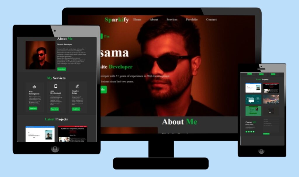
1. Header Section:
- Creates the website header with:
A logo (“Spanking”)
Navigation bar with links to different sections of the website (Home, About, Services, Portfolio, Contact)
A menu icon for mobile responsiveness.
2. Home Section:
- Home section with id Home introduces the website owner with a slide animation (“Hello”, “I’m”), name (“Usama”), title (“Website Developer”), and brief description.
Includes a button linked to the “About” section.
3. About Section:
- About section with id About displays an image on the left side and text content on the right side of the web page.
- It briefly describes the website owner’s (Usama) experience and expertise in web development.
- Includes a “Learn More” button.
4. Services Section:
- Services Section with id Services showcases three services offered with icons:
Web Development
App Development
Creative Design
Each service includes a brief description and a “Read More” button.
5. Portfolio Section:
- A portfolio section with an ID portfolio displays a grid of six project thumbnails with titles, their descriptions, and external links to direct visitors to another page.
6. Contact Section:
- The contact section with ID contact creates a contact form to collect contact information like name, phone number, email, and message fields.
Source code of CSS file.
*
{
    padding: 0;
    margin: 0;
    box-sizing: border-box;
    text-decoration: none;
    list-style: none;
    scroll-behavior: smooth;
}
:root
{
    --first-bg-color:#303030;
    --second-bg-color:#2c2c2c;
    --first-text-color:#ffffff;
    --second-text-color:#b6b6b6;
    --main-color:#00b135;
    --large-font:5rem;
    --h2-font:3rem;
    --p-font:1.1rem;
}
body
{
    background:var(--first-bg-color);
    color: var(--first-text-color);
}
header
{
    position: fixed;
    width:100%;
    top:0;
    right:0;
    z-index: 100;
    display: flex;
    align-items: center;
    justify-content: center;
    background: transparent;
    padding: 22px 15%;
    border-bottom: 1px solid transparent;
    transition: all .45s ease;
}
.logo
{
    color: var(--first-text-color);
    font-size: 36px;
    font-weight: 600;
    letter-spacing: 1px;
}
span
{
    color: var(--main-color);
}
.navlist
{
    display: flex;
}
.navlist a
{
    color: var(--second-text-color);
    font-size: 18px;
    margin: 0 25px;
    font-weight: 600;
    transition: all .4s ease;
}
.navlista:hover
{
    color: var(--main-color);
}
#menu-icon
{
    font-size: 33px;
    color:var(--first-text-color);
    z-index: 1000;
    margin-left: 25px;
    display: none;
}
section
{
    padding: 0px 160px 20px 125px ;
}
.home
{
    position: relative;
    height: 100vh;
    width: 100%;
    background-image: url(background.jpg);
    background-size:cover;
    background-position: center;
    display: flex;
    align-items: center;
    justify-content: flex-start;
}
.slide
{
    margin-bottom: 18px;
}
.one
{
    display: inline-block;
    margin-right: 5px;
    padding: 0 18px;
    line-height: 32px;
    font-size: 20px;
    font-weight: 600;
    border-radius: 5px;
    background: var(--main-color);
    color: var(--first-text-color);
}
.two
{
    display: inline-block;
    color: var(--main-color);
    font-size: 20px;
    font-weight: 600;
}
.home-text h1
{
    font-size: var(--large-font);
    font-weight: 700;
    color: var(--first-text-color);
    margin: 0 0 8px;
    line-height: 1.5;
}
.home-text h3
{
    color: var(--first-text-color);
    margin: 0  0 22px;
    font-size: 2rem;
}
.home-text p
{
    color: var(--second-text-color);
    font-size: var(--p-font);
    line-height: 1.8;
}
.button
{
    display: inline-block;
    align-items: center;
    justify-content: center;
}
.btn
{
    display: inline-block;
    font-size: 18px;
    padding: 12px;
    margin-top: 10px;
    letter-spacing: 1px;
    background: var(--main-color);
    color: var(--first-text-color);
    border-radius: 7px;
    transition: all 0.5s ease;
}
.btn:hover
{
    transform: scale(0.9);
}
.about
{
    display: grid;
    grid-template-columns: repeat(2,1fr);
    align-items: center;
    gap: 1.5rem;
}
.about-img img
{
    margin-top: 50px;
    max-width: 530px;
    height: auto;
    width: 100%;
    border-radius: 5px;
}
.about-text h2
{
    font-size: var(--h2-font);
    line-height: 1.3;
}
.about-text h4
{
    font-size: 23px;
    font-weight: 600;
    color: var(--first-text-color);
    letter-spacing: 1px;
    line-height: 1.8;
    margin:25px 0 30px 0px;
}
.about-text p
{
    color: var(--second-text-color);
    font-size: var(--p-font);
    line-height: 1.4;
    margin: 25px 0 30px 0;
}
.Services
{
    background: var(--second-bg-color);
    padding-top: 50px;
}
.main-text h2
{
    font-size: var(--h2-font);
    margin-bottom: 20px;
}
.main-text
{
    text-align: center;
}
.main-text p
{
    color: var(--second-text-color);
    font-size: 16px;
    margin-bottom: 15px;
}
.services-container
{
    display: grid;
    grid-template-columns: repeat(auto-fit ,minmax(250px , auto));
    align-items: center;
    gap: 2.5rem;
}
.box
{
    background: var(--first-bg-color);
    padding: 35px 45px;
    transition: all .5s ease;
}
.services-icons i
{
    font-size: 60px;
    margin-bottom: 20px;
    display: flex;
    justify-content: center;
    margin-left: -15px;
}
.box h3
{
    font-size: 25px;
    font-weight: 600;
    color: var(--first-text-color);
    margin-bottom: 15px;
}
.box p
{
    color: var(--second-text-color);
    font-size: 1rem;
    line-height: 1.2;
    margin-bottom: 20px;
}
.box:hover
{
    transform: translateY(-10px);
}
.portfolio .main-text
{
    margin-top: 30px;
}
.portfolio-content
{
    display: grid;
    grid-template-columns: repeat(auto-fit,minmax(360px,auto));
    align-items: center;
    gap: 3rem;
    margin-top: 4rem;
}
.row
{
    position: relative;
    overflow: hidden;
    border-radius: 10px;
}
.row img
{
    width: 100%;
    height: 70%;
    border-radius: 10px;
    display: block;
    transition: transform 0.5s;
}
.layer
{
    width: 100%;
    height: 0;
    background: linear-gradient(rgba(0, 0, 0, 0.6) , #08f800);
    position: absolute;
    left: 0;
    bottom: 0;
    overflow: hidden;
    display: flex;
    flex-direction: column;
    align-items: center;
    padding: 0px 45px;
    transition: height 0.5s;
}
.layer h4
{
    font: 25px;
    font-weight: 600;
    margin:5px 0 5px 0;
}
.layer p
{
    color: var(--first-text-color);
    font-size: 1rem;
    line-height: 1.2;
    margin-bottom: 10px;
}
.layer i
{
    color: var(--first-text-color);
    margin: 5px 0 5px 0;
    font-size: 25px;
    background: var(--first-bg-color);
    border-radius: 5px;
}
.row:hover img
{
    transform: scale(1.1);
}
.row:hover .layer
{
    height: 110px;
}
.contact
{
    background:var(--second-bg-color);
    display: grid;
    grid-template-columns: repeat(2,1fr);
    align-items: center;
    gap: 2.5rem;
    margin-top: 20px;
    padding-top: 30px;
}
.contact-text h2
{
    font-size: var(--h2-font);
}
.contact-text h4
{
    color: var(--first-text-color);
    margin: 20px 0;
    font-size: 20px;
}
.list
{
    margin-bottom: 2.5rem;
}
.list li
{
    margin-bottom: 15px;
}
.list li a
{
    display: block;
    color: var(--second-text-color);
    font-size: 18px;
    transition: all 0.5s ease;
}
.listlia:hover
{
    color: var(--first-text-color);
    transform: translateY(5px);
}
.contact-icons i
{
    height: 45px;
    width: 45px;
    background: var(--main-color);
    color: var(--first-text-color);
    font-size: 25px;
    display: inline-flex;
    align-items: center;
    justify-content: center;
    border-radius: 50%;
    transition: all 0.5s ease;
    margin-right: 10px;
}
.contact-iconsi:hover
{
    color: var(--second-text-color);
    transform: translateY(-5px);
}
.contact-form form
{
    position: relative;
}
.contact-form form input,textarea
{
    width: 100%;
    padding: 10px 10px 10px 20px;
    display: block;
    margin-bottom: 10px;
    background: var(--first-bg-color);
    color: var(--first-text-color);
    border: none;
    font-size: 20px;
    border-radius: 10px;
}
.contact-form textarea
{
    resize: none;
    height: 200px;
}
.contact-form .submit
{
    width: 160px;
    background-color: var(--main-color);
    padding: 10px;
    transition: all 0.5s ease;
}
.contact-form .submit:hover
{
    transform: scale(1.1);
}
@media (max-width:1480px)
{
    header
    {
        padding: 12px 2.5%;
        transition: 0.1s;
    }
    selection
    {
        padding: 110px 3% 60px;
    }
}
@media (max-width:1100px)
{
    :root
    {
        --large-font:5rem;
        --h2-font:2.5rem;
        --p-font:1rem;
        transition: 0.1s;
    }
    .home-texth3
    {
        font-size: 2.5rem;
    }
    .home
    {
        height:85vh;
    }
}
@media (max-width:920px)
{
    .about
    {
        grid-template-columns: 1fr;
    }
    .about-imgimg
    {
        width: 100%;
        height: auto;
        max-width: 100%;
    }
    .contact
    {
        grid-template-columns: 1fr;
    }
}
@media (max-width:750px)
{
    header
    {
        display: flex;
        justify-content: space-between;
    }
    #menu-icon
    {
        display: block;
    }
    .navlist
    {
        position: absolute;
        top: -1000px;
        right: 0;
        left: 0;
    }
    section
    {
        margin-top: 60px;
    }
    .main-text
    {
        padding: 0;
        margin: 0;
    }
}
@media (max-width:550px)
{
    .portfolio-content .row
    {
        margin-right: 85px;
        transition: 0.6s;
    }
    .row:hover .layer
    {
    height: 100%;
    }
}
Save this code as style.css
Explanation
1. Global Styles:
- *: Resets default browser styles for padding, margin, and list-style elements.
- :root: Defines custom CSS variables for the color palette, font sizes, and scroll behavior.
2. Body:
- Sets background color and text color based on variables defined in :root.
3. Header:
- Sets position, width, background color, padding, and border.
- Uses flex properties to center content horizontally and vertically.
- Applies a smooth transition effect on hover for responsiveness.
4. Navigation:
- Styles the logo text.
- Defines styles for navigation links, including color, font size, margin, weight, and hover effect.
- Hides the hamburger menu icon initially (display: none).
5. Sections:
- Defines padding for all sections.
6. Home Section:
- Sets height, background image, and display style.
- Styles the introductory slide text with colors, font sizes, and line-height.
- Styles the button with background color, text color, and hover effect.
7. About Section:
- Uses a grid layout with two columns for text and image content.
- Styles the image with a border-radius and maximum width.
- Applies styles for headings, including color, font size, weight, and line-height.
- Styles paragraph text with color, font size, and line-height.
8. Services Section:
- Sets background color and padding.
- Styles the main heading with font size and margin.
- Defines a grid layout with automatic fitting for service boxes.
- Styles the service boxes with background color, padding, and hover effect.
- Uses icons with font size, margin, and color settings.
9. Portfolio Section:
- Styles the main heading with a margin.
- Defines a grid layout with automatic fitting for portfolio thumbnails.
- Styles the individual thumbnails with hover effects for scaling and revealing overlay text.
- Defines styles for elements within the overlay, including headings, paragraphs, and icons.
10. Contact Section:
- Sets background color, grid layout, and gap between elements.
- Styles headings and lists with colors, font size, and margin.
- Styles list items and link hover effects.
- Defines styles for social media icons, including size, color, background, and hover effect.
- Styles the contact form, including input fields, text area, and submit button, with colors, sizes, borders, and hover effects.
11. Media Queries:
- The code uses various @media queries to adjust styles for different screen sizes, ensuring responsiveness across various devices:
- 1480px and below: Adjusts header padding and section padding.
- 1100px and below: Adjusts font sizes and home section height.
- 920px and below: Changes the layout of the “About” and “Contact” sections to single columns.
- 750px and below: Shows and styles the hamburger menu icon, changes navigation layout and behavior, and adjusts section margins.
- 550px and below: Adjusts margin and hover effect behaviors for portfolio thumbnails.
Thanks for reading this article.