LEARN HOW TO CREATE STYLISH SIGN IN PAGE WITH HTML CSS
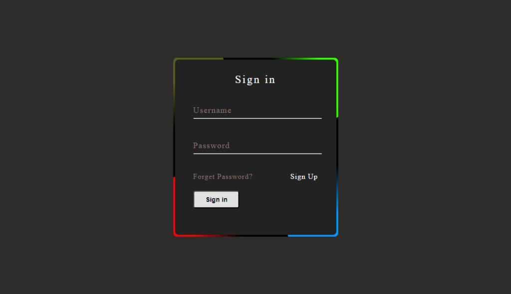
How to create stylish sign in page with HTML CSS.
- Use HTML to structure the a Sign in page.
- Use CSS file to to style the sing in page.
The source code for this project is available for download by clicking ‘Download Now’ or cloning the GitHub repository.
Source code of HTML file.
<!DOCTYPE html>
<html lang="en">
<head>
    <meta charset="UTF-8">
    <meta name="viewport" content="width=device-width, initial-scale=1.0">
    <title>Login Page</title>
    <link rel="stylesheet" href="style.css">
</head>
<body>
    <Div class="box">
        <span class="border-line"></span>
        <form >
            <h2>
                Sign in
            </h2>
            <div class="inputbox">
                <input type="text" required>
                <span>Username</span>
                <hr>
            </div>
            <div class="inputbox">
                <input type="password" required>
                <span>Password</span>
                <hr>
            </div>
            <div class="links">
                <a href="#">
                    Forget Password?
                </a>
                <a href="#">
                    Sign Up
                </a>
            </div>
                <input type="submit" value="Sign in">
        </form>
    </Div>
</body>
</html>
Save this file with .HTML extension.
Explanation.
Body:
- <Div class=”box”>: Defines a first-rate container detail with the class “container”. This class possibly has patterns defined in the CSS file for layout and positioning.
- <span class=”border-line”></span>: This appears to be a decorative detail with the class “border-line” probably used to create a visible border around the box.
Form:
- <form>: Defines a form detail for gathering person input data for login.
- <h2>Sign in</h2>: Sets the heading for the form with the text “Sign in”.
- <div class=”inputbox”>: Creates two separate enter containers with the class “inputbox”. These in all likelihood have patterns defined inside the CSS for formatting and spacing.
- <input type=”text” required>: First input subject of type “text” with the “required” characteristic, probable for getting into the username.
- <span>Username</span>: Label detail associated with the username input field.
- <hr>: Horizontal line for separation between input fields.
- <div class=”links”>: Creates a container for hyperlinks with the class “links”. Likely styled inside the CSS for format.
- <a href=”#”>Forget Password?</a>: Link with text “Forget Password?” probable leading to a password restoration web page.
- <a href=”#”>Sign Up</a>: Link with textual content “Sign Up” probably leading to a registration page.
- <input type=”submit” value=”Sign in”>: Submit button with the textual content “Sign in” which triggers form submission while clicked.
Source code of CSS file.
*
{
    margin: 0;
    padding:0;
    box-sizing: border-box;
}
body
{
    display: flex;
    justify-content: center;
    align-items: center;
   min-height: 100vh;
    background-color: #2e2b2b;
}
.box
{
    position: relative;
    width: 360px;
   height: 390px;
   color: #000000;
   background-color: #000000;
   border-radius: 8px;
   overflow: hidden;
}
.box::before
{
    content: '';
    position: absolute;
    top: -50%;
    left: -50%;
    width: 360px;
    height: 390px;
    background: linear-gradient(0deg,transparent
    ,transparent,#0099ff,#0099ff,#0099ff);
    z-index: 1;
    transform-origin: bottom right;
    animation: animate 6s linear infinite;
}
.box::after
{
    content: '';
    position: absolute;
    top: -50%;
    left: -50%;
    width: 360px;
    height: 390px;
    background: linear-gradient(0deg,transparent
    ,transparent,#585f1a,#585f1a,#585f1a);
    z-index: 1;
    transform-origin: bottom right;
    animation: animate 6s linear infinite;
    animation-delay: -3s;
}
.border-line
{
    position: absolute;
    top: 0;
    inset: 0;
}
.border-line::before
{
    content: '';
    position: absolute;
    top: -50%;
    left: -50%;
    width: 360px;
    height: 390px;
    background: linear-gradient(0deg,transparent
    ,transparent,#ff0000,#ff0000,#ff0000);
    z-index: 1;
    transform-origin: bottom right;
    animation: animate 6s linear infinite;
    animation-delay: -1.5s;
}
.border-line::after
{
    content: '';
    position: absolute;
    top: -50%;
    left: -50%;
    width: 360px;
    height: 390px;
    background: linear-gradient(0deg,transparent
    ,transparent,#33ff00,#33ff00,#33ff00);
    z-index: 1;
    transform-origin: bottom right;
    animation: animate 6s linear infinite;
    animation-delay: -4.5s;
}
@keyframes animate
{
    0%
    {
        transform:rotate(0deg);
    }
    100%
    {
        transform:rotate(360deg);
    }
}
.box form
{
    position: absolute;
    inset: 4px;
    background: #222222;
    padding: 30px 40px;
    border-radius: 8px;
    z-index: 2;
    display: flex;
    flex-direction: column;
}
.box form h2
{
    text-align: center;
    margin-bottom: 25px;
    font-weight: 500;
    color: #fff;
    letter-spacing: 3px;
}
.box form .inputbox
{
    position: relative;
    width: 280px;
    margin-bottom: 30px;
}
.box form .inputbox input
{
    position: relative;
    width: 100%;
    padding: 18px 11px 11px 1px;
    background:transparent;
    border: none;
    outline: none;
    box-shadow: none;
    color: #faf5f5;
    font-size: 1em;
    letter-spacing: 0.08em;
    transition: 0.5s;
    z-index: 10;
}
.box form .inputbox span
{
    position: absolute;
    left: 0;
    padding: 18px 0px 10px;
    pointer-events: none;
    color: #8f7373;
    letter-spacing: 0.08em;
    font-size: 18px;
    font-weight: 500;
    transition: 0.5s;
}
.box form .inputbox input:valid ~ span,
.box form .inputbox input:focus ~ span
{
    color: #fff;
    font-size: 0.75em;
    transform: translateY(-35px);
}
.box form .inputbox hr
{
    position: absolute;
    left: 0;
    bottom: 0;
    width: 100%;
    border-radius: 4px;
    overflow: hidden;
    transition:0.5s;
    pointer-events: none;
}
.box form .inputbox input:valid ~ hr,
.box form .inputbox input:focus ~ hr
{
    height: 44px;
}
.box form .links
{
    display: flex;
    justify-content: space-between;
}
.box form .links a
{
    margin: 10px 0px;
    text-decoration: none;
    color: #8f7373;
    font-size: 16px;
    font-weight: 500;
    letter-spacing: 1px;
}
.box form .links a:hover,
.box form .links a:nth-child(2)
{
    color: #fff;
}
.box form input[type="submit"]
{
    padding: 9px 25px;
    background-color: #e2e1e1;
    font-size: 0.9em;
    font-weight: 600;
    color: #000000;
    border-radius: 4px;
    width: 100px;
    margin:12px 0 0 0;
    border: none;
    outline: none;
}
.box form input[type="submit"]:active
{
   opacity: 0.8;
}
Save this code as style.ss
Explanation.
Global Style:
- *: Resets both browser margins and default padding, enabling consistent styling.
- body: Sets the contents to medium and moderate, sets the minimum height to 100vh (viewport height), and sets the background color to black.
Box Style:
- .box: Defines the main character by shape, black background, rounded corners, and hidden overflow.
- Use the .box::before and .box::after: linear gradients rotating around the box to create two interesting backgrounds, adding dynamic effects.
- .border-line: Draws a decorative border around the box.
- .border-line::before, .border-line::after: Add interesting color borders with different seasons, create a layered effect.
- @keyframes animate: Defines background animation and border rotation.
Form Styles:
- .box card: Place the card in a box with padding, rounded corners, and a black background.
- .box form h2: Creates the form title using colors, font spacing, and margins.
- .box form .inputbox: Styles individual input fields and their labels.
- .box form .inputbox input: Sets the styles for the input fields themselves, including transparency, no border, and color changes in focus or validity.
- .box form .inputbox span: Locations and styles input labels, changing color and size in focus or validity.
- .box form .inputbox hr: Styles underlines for input fields, making their height interesting in focus or validity.
- .box form .links: Match the links in the form.
- .box form .links that: Styles links with colors, fonts, and hover effects.
- .box form input[type=”submit”]: Sets the color, size, font, and hover effect for the submit button.
Thanks for reading this article.